Where Traveler is the world’s best information source for travelers, fueled with thousands of local listings, travel tools, and recommendations by travel experts in the local market. While working as a graphic designer for Morris Communications, Erin had the fantastic opportunity to procure the role of Art Director for several markets. These images are from one of the publications; “Where Traveler : Washington D.C.”.
Where Traveler, Washington D.C. | https://www.wheretraveler.com/washington-dc-nov-2019
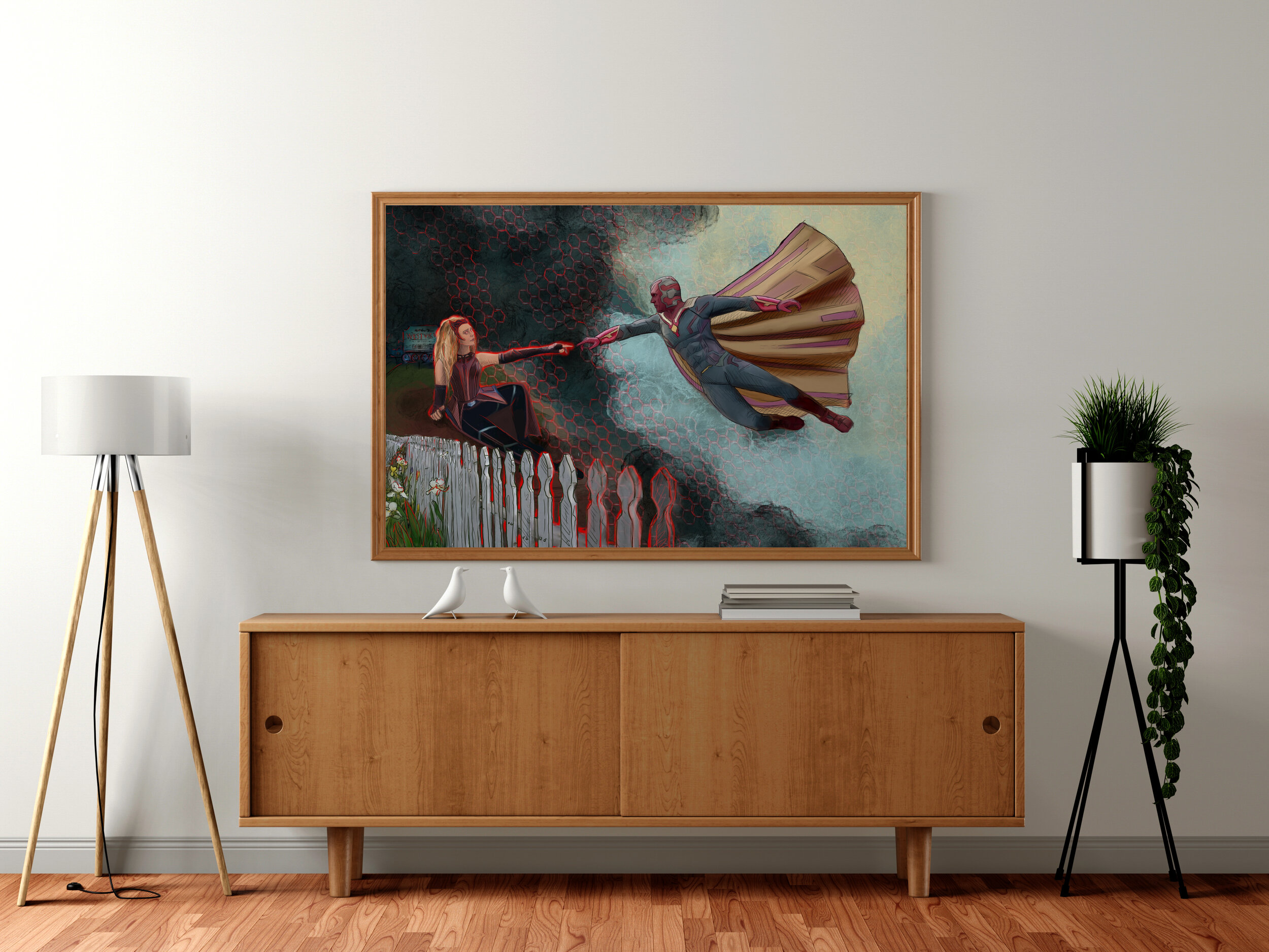
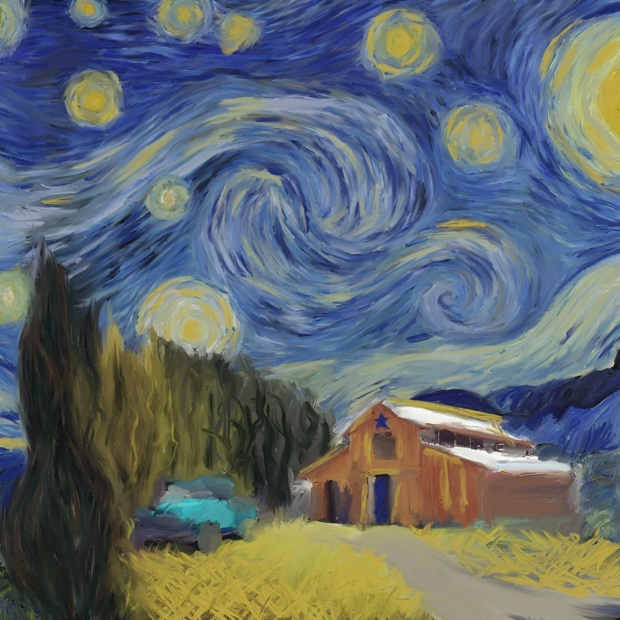
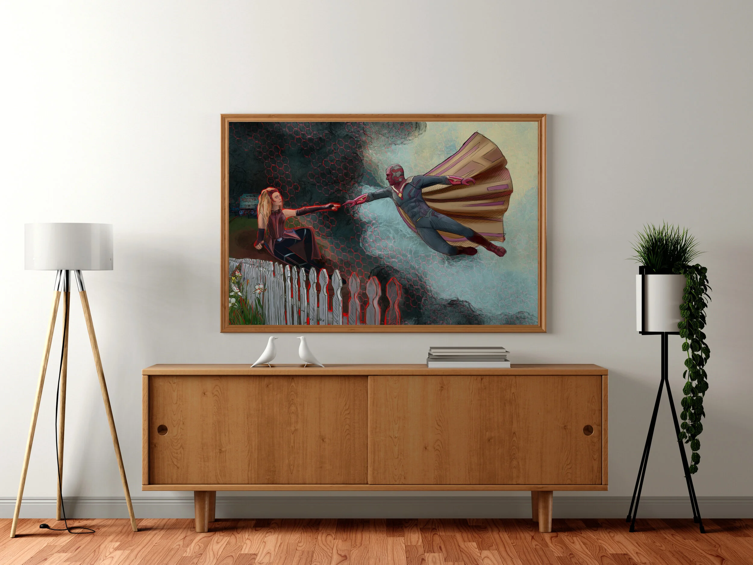
Original digital artwork and some fun fan art by Erin Crocker.
The Gertrude Herbert Institute of Art is Augusta’s only independent nonprofit visual arts school and contemporary art gallery. Displayed here are; the Self-guided Tour brochure and stickers , as well as a new logo centered around the physical landmark that is tied so heavily to the identity of GHIA within the community.
Logo developed for a channel that promotes the integration of art and science. The Name Art | S represents art and science. The intentional separation of the Art and S exposes the predefined boundaries many individuals have placed on art and science. However, on each side of the separation are found the basic shapes and colors that are elementary to both Art and Science. These commminalities in subject matter are fundimental in many ways to this unique view of art and science that the channel promotes, and will encourage the audience to gain a new perspective on the two subjects.
This Logo and Business Card required a mixture of masculinity and elegance to represent a home remodeling company. Using an original construction of the letter J a precise and strong center for the letter is maintained, while the elongation and decorative marks placed in the vicinity of the loop promote the elegant aesthetic that promoted the company’s identity.
Logo Design made for a company that focuses on the science of bicycles. This design based on a bicycle pedal, makes use of the horizontal bars in the physical structure, as well as the negative space between them alternating between black and white letters for a universal and visually appealing design.
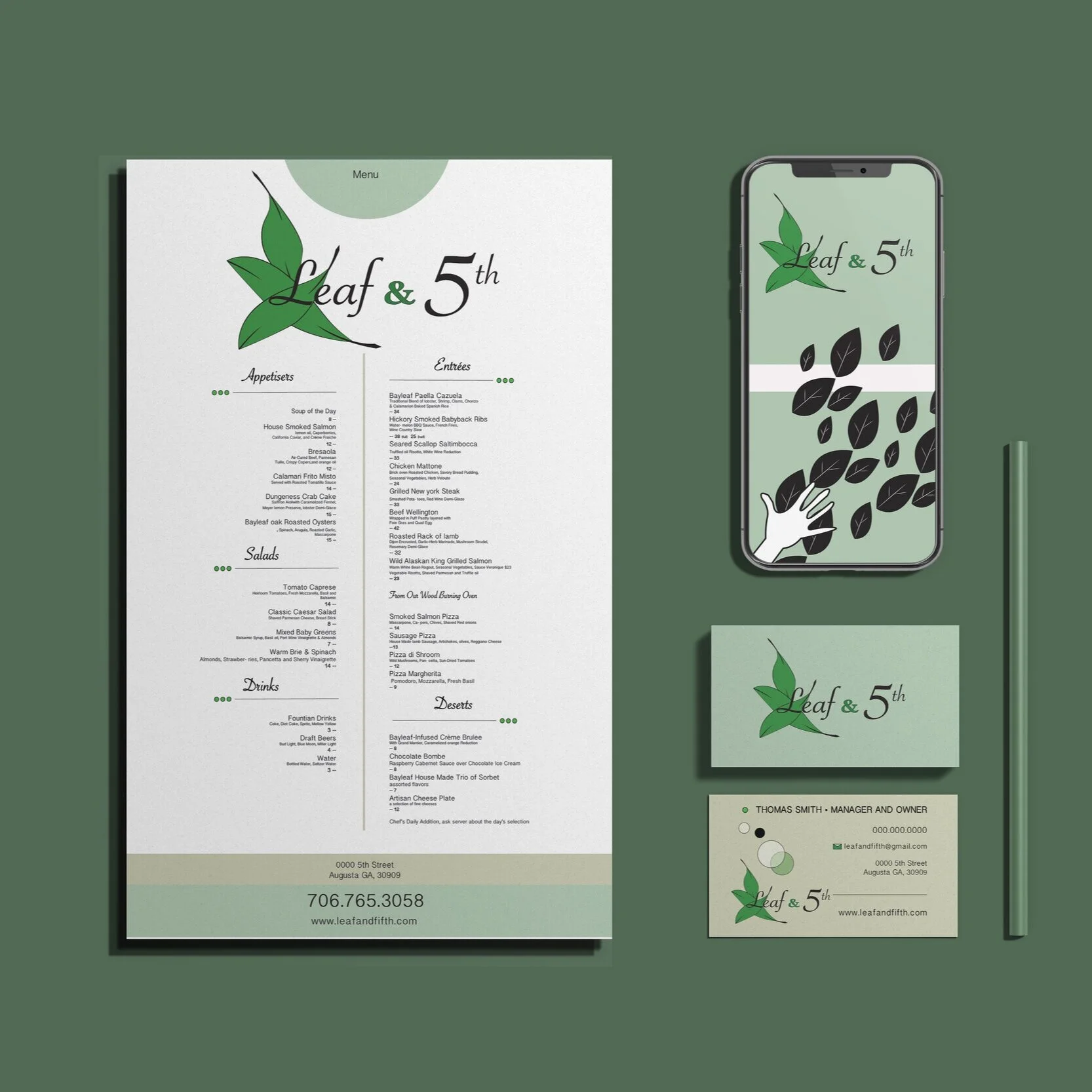
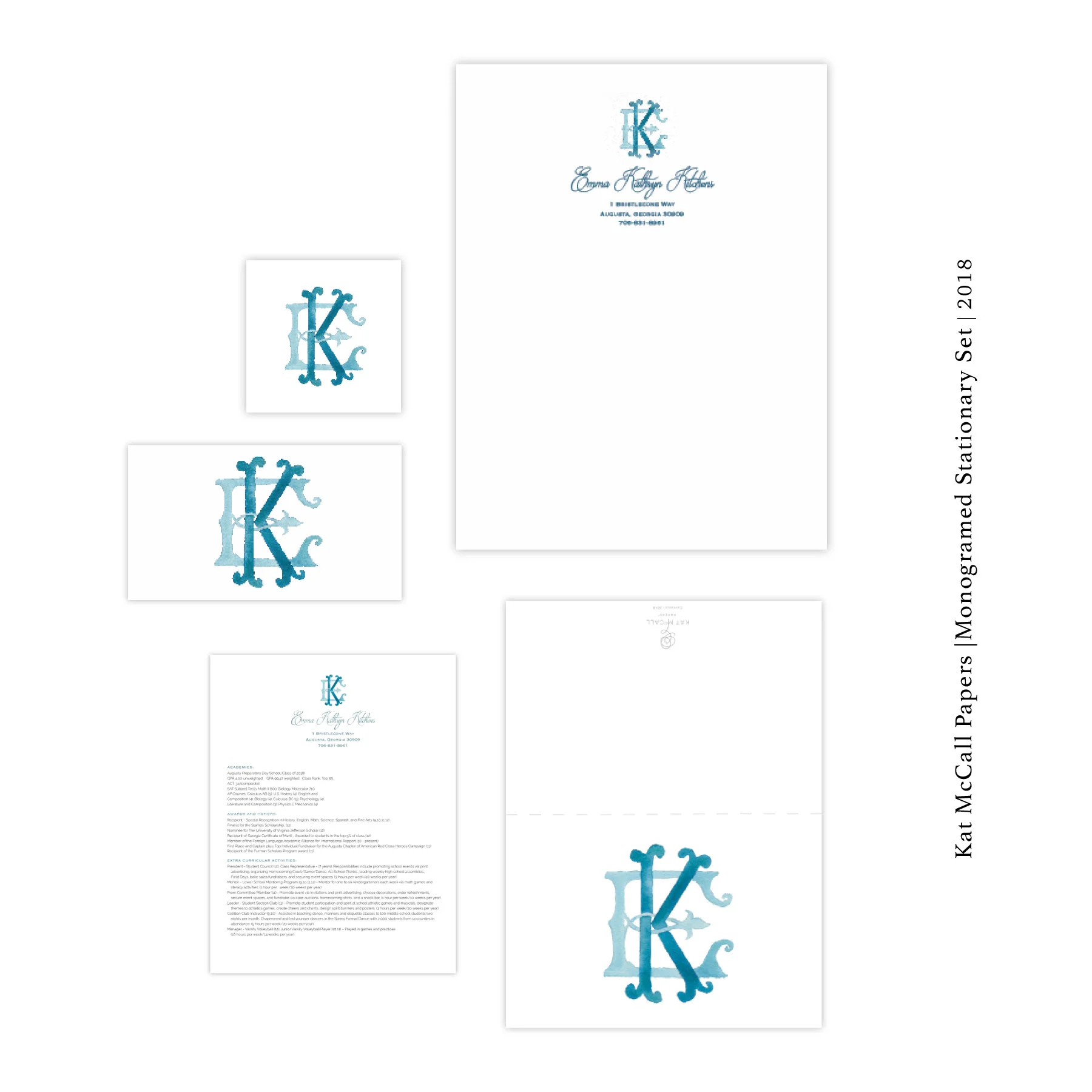
Here are some highlights of Erin Lee Crocker’s work for a luxury paper goods company with a focus on stationary items, Kat McCall Papers. This section includes examples of Layouts for Stationary Items, as well as image manipulation and assembly (from original watercolor art done by Kat McCall) using Adobe CC Programs.
Inspiring brand identity created from scratch for an upcoming film festival, that centered around raising awareness of domestic violence. The name Phoenix Fest felt serendipitous in its representation of strength, power, and rebirth . The idea of being “reborn from the ashes” is the truth of what many domestic violence victims experience. The color purple furthers this representation through its connection with the movement to raise awarness for domestic violence.
Original ceramic vessels created and painted by Erin Crocker
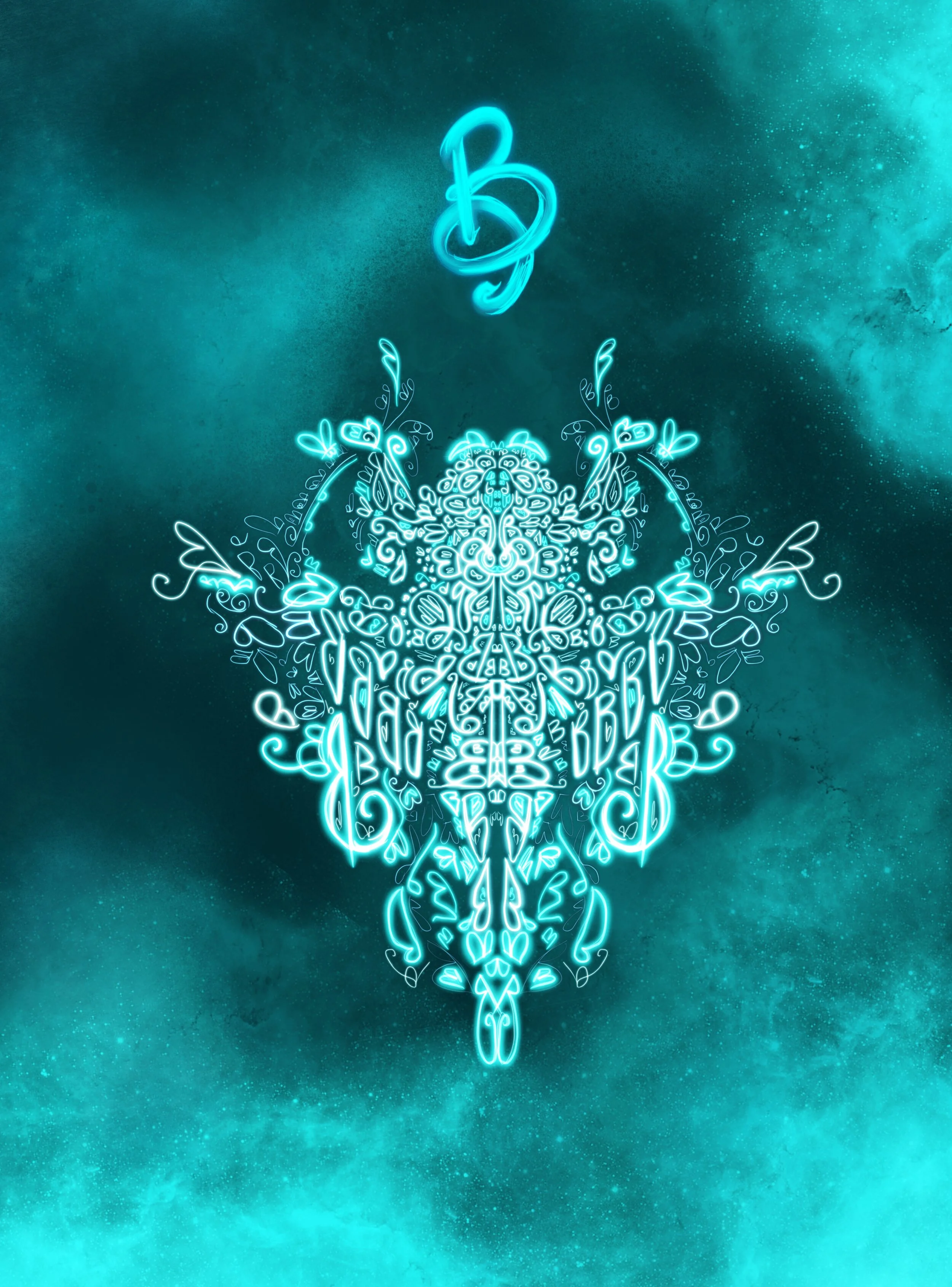
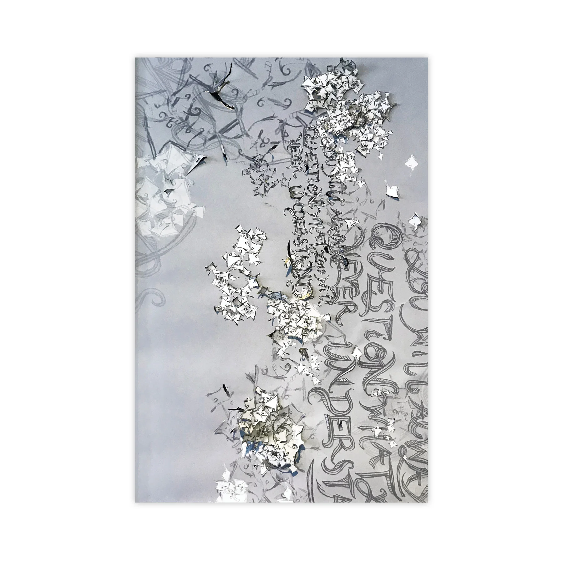
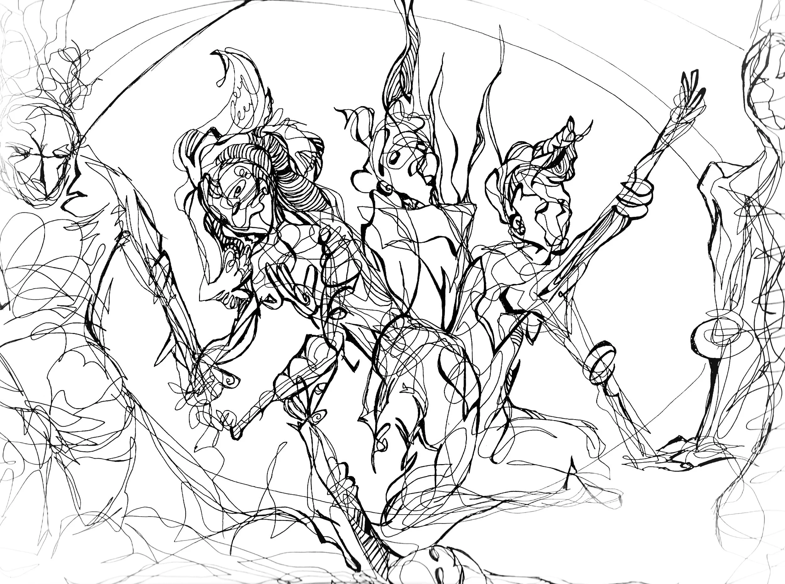
Drawings and Paintings by Erin Crocker